 Whether you want to call it a brochure, pamphlet or leaflet, we all know them as being boring collateral. Admit it. We are all guilty of having the initial intention to read those informative brochures, but they just end up chucked into the nearest dark abyss never to be seen again. Between the mountains of text and cheesy gimmicks that we have grown accustomed to, who could blame us, right? Thankfully, there is a happy ending to this age old tale of the boring brochure.
Stand Out from the Competition
Leave the bullet points behind and begin thinking outside of the box when creating your brochure. One of the best ways to make your company stand out from the rest is through custom features and design elements. From variations such as die cuts, quality paper, foil stamping and metallic inks, adding a little something, something can be the difference between success and the garbage can.
The Do’s and Don’ts of Brochures
Have no fear. Brio Five is here! We’ve put together a helpful list of do’s and don’ts to help you through your brochure making creative process. The following are some simple tips that will help your brochure to be modern, sharp, refined and most importantly effective.
Please Do
Know your end goal
Before you dive into it, know why you’re creating a brochure and what your want to achieve. This step will help you clearly establish your message and decide which custom features are best to execute that message.
Make the cover engaging
The cover is the first attention grabber, and will determine whether or not your audience will bother to open it. Your brochure cover should be captivating, strong, and clean.
White space is your friend
Just because you can, doesn’t mean you should. Let there be space to breathe around the page to navigate through with ease. Many people have a habit of wanting to cram as much info into a brochure as possible, but this can overwhelm your audience and end with your brochure in the trash.
Go beyond Helvetica
While Helvetica has its place in the history of default and commonly used typfaces, a little diversity never hurts. Try using creative typography that represents your business branding and grabs attention. Disclaimer; don’t go crazy here. Overdoing typography can come across unprofessional or amateur. Remember to keep it legible, unified and clear.
Have a transparent call to action
Don’t leave your audience in the dark. Make your call to action visible, concise and one that informs the reader of exactly what it is that they need to do.
Please Don’t
Show, don’t tell
Don’t bore your audience to death be brief. Throwing mass amounts of text across your brochure without any visual support is the quickest way to lose an audience. Bring life to the page with appropriate corresponding graphic elements, art and/or original photography.
Curb the stock photography
Relying solely on stock images can come across corny. Keep an edge over your competition and take your own high-quality photos. This will strengthen your branding message and grow a connection with your readers.
Don’t be conceited
While you may feel the need to explain your company and products thoroughly, most companies make the mistake of taking this a little too far. Instead of talking about yourself and all of the great things you do, think about your patrons. Center your brochure on the problems your customers have needed to be solved and how you have solved these problems. Your viewers are only interested in what you can do for them, not the product you do it with.
Get Creative and Colorful
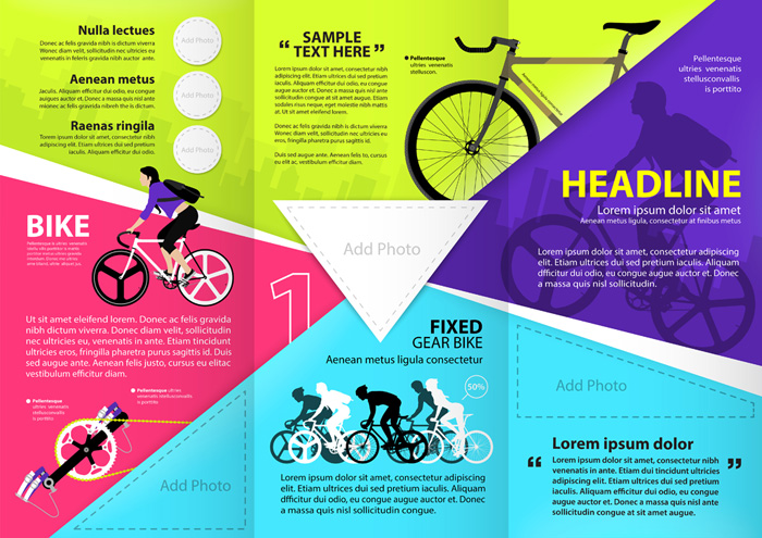
Your brochures don’t have to be boring and flat. Use colors and shapes to draw your customers eye in to where you want them to go. Below is an example of how colors and illustrations can be used to separate sections of text, add contrast, and featured topics. It doesn’t matter what your content it, good organization and use of colors can make it more digestible and easier to read.

There is a reason that brochures are still alive and well in today’s digital world, they do have their advantages. When done correctly, brochures are one of the best ways to market your business. When you’re ready to create your amazing brochure Brio Five is here to help and to set you up with everything you will need to make your company a success! Check out our graphic design services. For information on brochure printing please visit Printing For Less.
Are you interested in producing an image that shows your best self and conveys your authentic brand?
Book a Session today with Professional Brand Photographer Sandy Grigsby.

