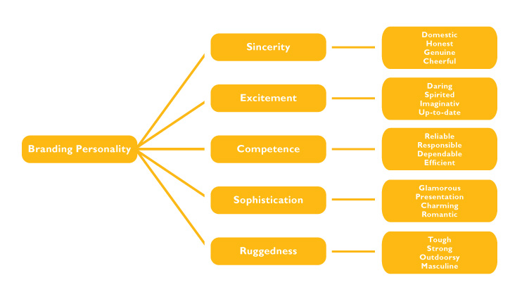
Although certain colors do broadly align with specific traits, (i.e. pink with girly, red with warning, and purple with sophistication) nearly every academic study on color and branding will state that it is more important for a brand’s colors to support its desired personality instead of trying to align with a specific color association. Color is important in branding, but be sure to recognize that colors mainly come into play when they can be used to parallel a brand’s preferred personality.
Stanford’s Professor Jennifer Asker have found in her studies on Dimensions of Brand Personality, five core dimensions that play a role in a brand’s personality:

So, when selecting a color over another, one must decide which desired personality trait(s) embodies the brand. Then pick a color that is appropriate for that trait.
Color Appropriateness
Color appropriateness, more simply, is the perceived fit of a color with what is being sold. If Harley Davidson motorcycles were pink, the brand’s perceived personality of ruggedness would change. Colors influence how consumers view the personality of the brand in question. With all that said, when it comes to branding, one must also keep in mind their competition. If the competition all uses blue, you’ll stand out by using red. Studies have shown that our brains prefer recognizable brands, which makes color incredibly important in brand identity. Its important that new brands specifically target logo colors that ensure differentiation from their top competitors.
Gender Preferences
Gender studies have shown that blue is the most liked color of both genders and orange as the least liked. Men also dislike purple which is probably why we don’t have any purple power tools. The study also showed that men were more likely to select bright colors while women preferred softer colors. Also, shades are preferred over tints by men while women prefer vice versa. It is obvious that men and women have a disparity in color preferences. Thus, keep this in mind when choosing a brand’s primary color palette. Depending on your audience, it pays to appeal more to the gender that make up a larger percentage.
The Isolation Effect
The Isolation Effect states that an item that stands out like a sore thumb is more likely to be remembered. Research clearly shows that participants are able to recognize and recall an item far better when it blatantly sticks out from its surroundings. For instance, a red button on a blue background webpage will stand out more than an analogous blue color. The red hits you because of its sharp contrast and in turn coaches the viewer on which color means take action.
In reality, there isn’t an easy, precise set of guidelines for choosing your brand’s colors. However, if you keep in mind the brand’s personality, color appropriateness, your audience and and end goal then you can get a good start at it. Good luck and get designing!
Are you interested in producing an image that shows your best self and conveys your authentic brand?
Personal Branding Photography for Experts, Entrepreneurs, Authors, Coaches, Professionals, Influencers, and Thought Leaders.
Schedule a Consultation today to Book Your Session with Sandy Grigsby.

